

Food styling is the arrangement of a dish and its surroundings for the camera. It includes how the food sits on the plate, which surface supports it, what props enter the frame and which details the chosen angle reveals. The aim is a readable food image that fits its purpose.
Start with the dish, then build the scene around it. This guide uses an original fictional three-toast concept to compare two different decisions: changing the plating and changing the surrounding props. The examples are actual generated images with downloadable originals and prompts. They support a discussion of styling; they are not photographs of a restaurant order.
What food styling changes
Food styling works at two scales: the arrangement within the plate and the plate’s position within the photograph. Nikon’s food-photo article with Alison Lyons discusses both rearranging food and moving the dish within the scene. A useful styling review considers both, rather than judging the garnish in isolation.
A food photographer also makes decisions about light, focus and exposure. An AI editing workflow adds another set of decisions about references and supported operations. Our AI food photography guide covers that broader generation and campaign process. This page concentrates on the plate, props and composition you need to decide first.
Write a food styling brief before choosing props
Describe what the picture needs to communicate. A menu image may need an unobstructed view of the complete serving. A recipe opener may need room for a title. A social ad may need a tighter crop with the most recognisable part of the dish. Those uses do not automatically call for the same arrangement.
| Brief field | Question to answer | Original study choice |
|---|---|---|
| Dish specification | What must remain identifiable | Three toasts with two tomato slices and one basil leaf each |
| Image purpose | What should the viewer understand | Compare plating and surrounding props |
| Angle | Which view reveals the important detail | Overhead view with separated toast outlines |
| Plating | How will the food occupy the plate | Diagonal row or loose triangle |
| Props | What context is worth adding | Coral linen and one table knife in the prop case |
| Delivery | Where will the final crop appear | Wide comparison image with all three pieces visible |
Download the original styling shot brief to adapt these fields. Its entries describe proposed views and requested changes. Keep a separate record of what the returned image or actual photograph shows.
Use a simple food styling workflow
- Confirm the serving — identify the food, included components and presentation you need to represent.
- Choose the camera view — inspect which edges, layers and toppings remain visible.
- Make a baseline — photograph or develop the dish without extra scene decoration.
- Change one styling decision — try another plate arrangement or add a restrained prop group.
- Compare the actual frames — review the food, space, crop and distractions before adding more.
Adobe’s food-photography guidance recommends documenting the scene as styling develops, beginning simply and adding props progressively. Keeping the earlier frame gives you a useful alternative if the additional styling becomes distracting.
For an owned physical dish, set the camera and scene before the final presentation. Keep the approved serving specification beside the shoot brief. For a fictional concept, define the intended food clearly enough that variations can be compared. These are different starting references, even when they use the same styling vocabulary.
Inspect our original plating and prop examples
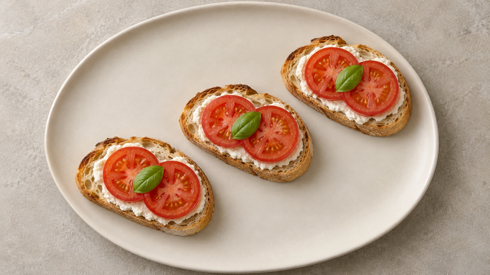
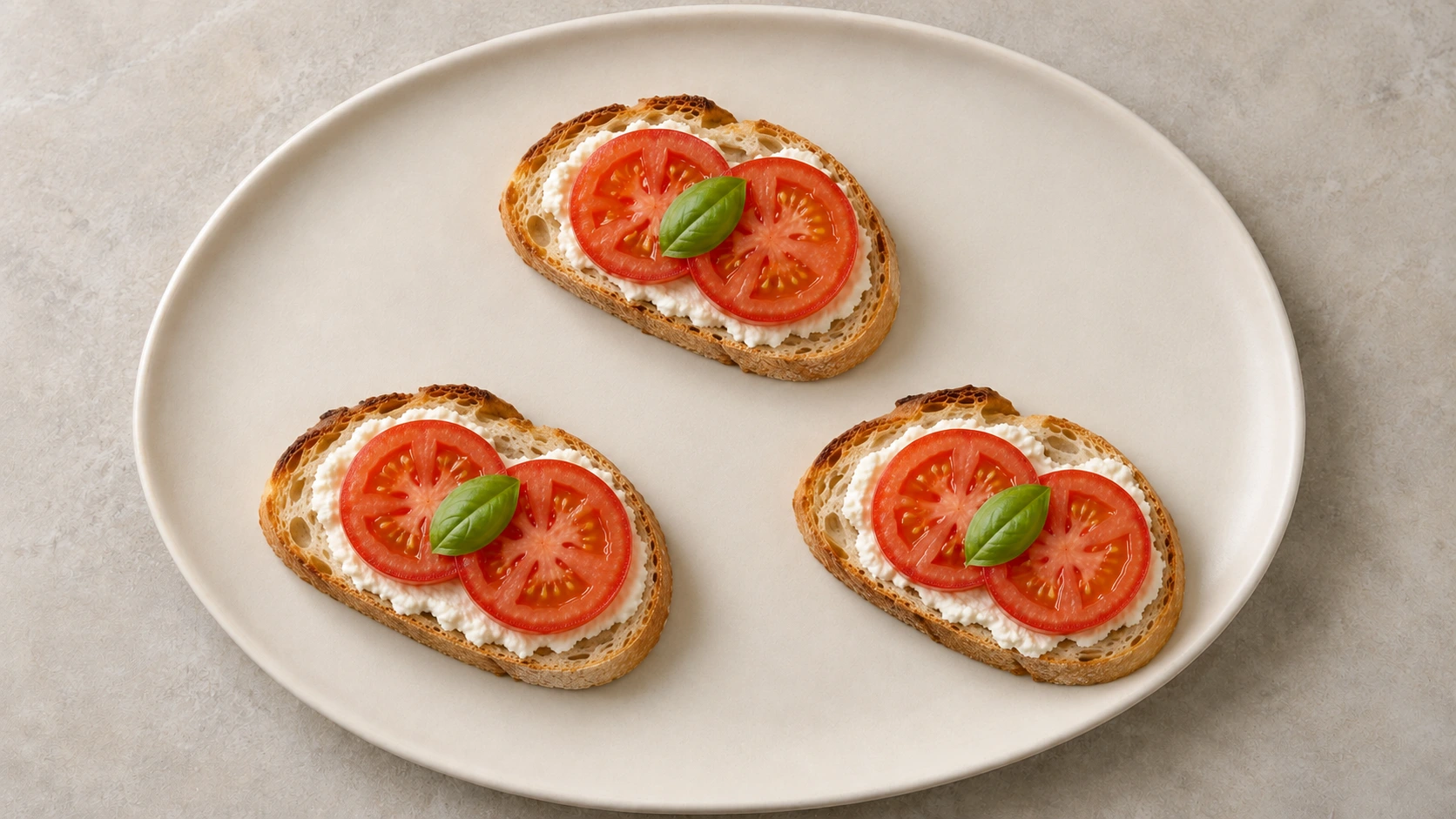
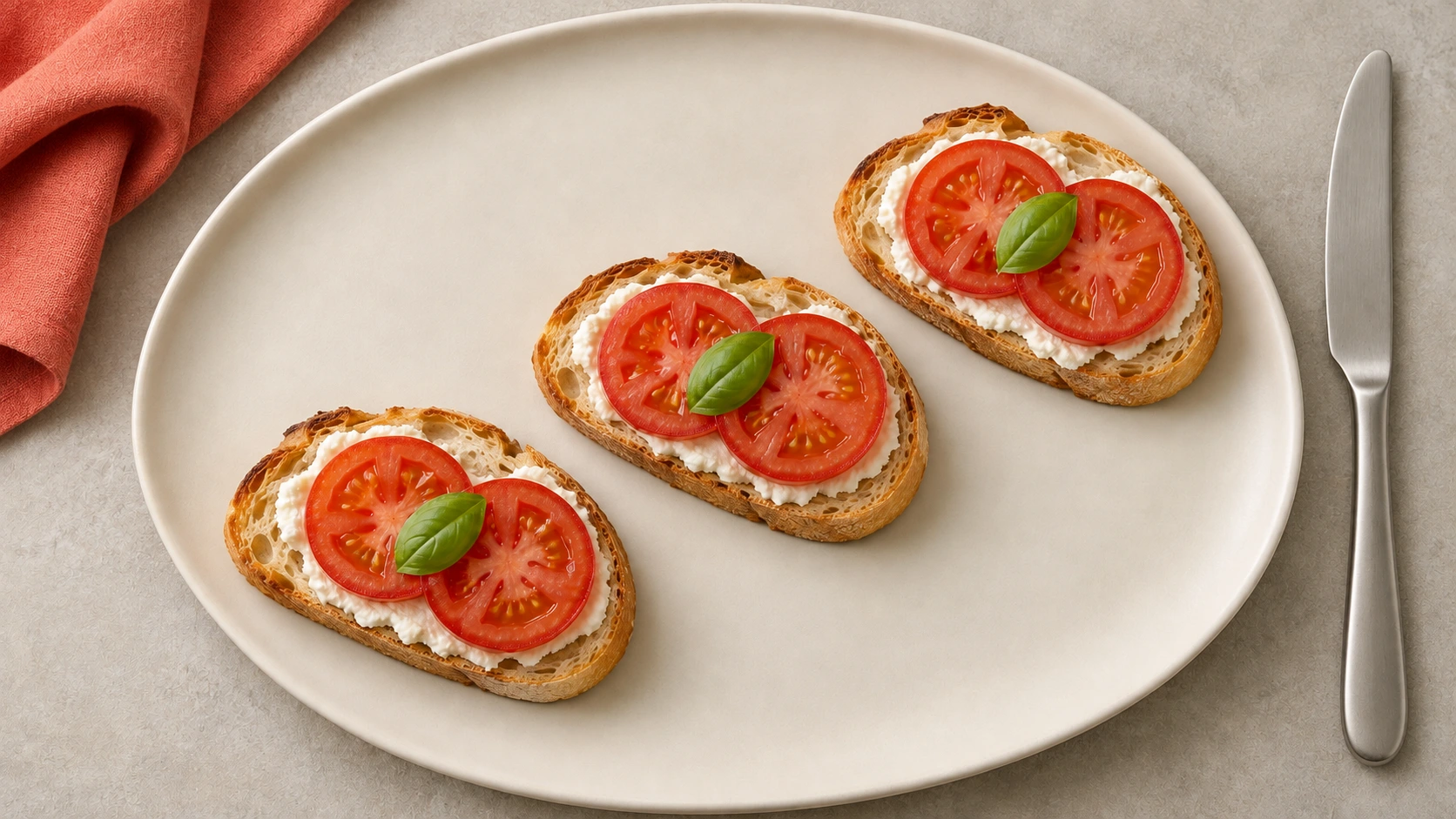
We generated a fictional plate with three tomato toasts in a diagonal row. Each piece has a visible white spread, two red tomato slices and one green basil leaf. We then made two independent edits, each referencing that same original PNG: one requested triangular plating, and the other requested props around the original row.
| Returned image | Visible observation | Styling question |
|---|---|---|
| Diagonal row | Three separated toast outlines follow one diagonal across the plate | Does the row make the serving easy to read |
| Triangle edit | One toast sits above two lower pieces with open plate space between them | Does the wider arrangement fit the intended frame |
| Prop edit | Coral cloth enters from upper left and a knife sits outside the plate at right | Do the surrounding objects add useful context or compete with the dish |
Visual review found three toasts, six tomato slices and three whole basil leaves in each returned image. The triangle edit changes the distribution of the food. The prop edit preserves the broad diagonal arrangement while adding visible cloth and cutlery. All three show enough of each toast to count the pieces.
The bread contours, tomato texture, spread edges and fine surface detail also change. This is a generative comparison, not a pixel-identical rearrangement of fixed photographed objects. The tool did not expose a backend model or inference settings. Neither matching counts nor an appetising appearance establishes ingredient identity, taste, serving weight or the accuracy of a real menu portion.
Choose a plate and leave useful space
Begin with the relationship between food and plate. A plate that is visually busy can compete with small toppings. A dish positioned too close to the rim can make the arrangement feel cramped. A very large empty area may be useful for a particular composition, but it should be deliberate.
In the row example, the repeating pieces create a diagonal path. The triangle spreads the food into a wider shape and creates space between the three pieces. Neither arrangement is a universal improvement. Compare the required crop: a narrow crop that works for the row may cut a lower toast from the triangle.
The Institute of Culinary Education’s styling article emphasizes image purpose, color, props and space. Apply those ideas by reviewing the actual camera view. A plate can look attractive on the table while an overhead photograph hides a layered ingredient or an important edge.
Choose food styling props with a clear role
A prop should support the scene you are trying to make. A folded cloth can introduce texture or a color accent. A utensil can suggest how the dish is eaten. A serving board can establish a setting. Add the object because it helps the image, then check whether the food still leads.
Our coral linen adds a large warm accent near the upper-left edge. The knife creates a bright vertical element at the right. Those additions make the frame busier even though the toast row remains. If the purpose is a clear serving reference, the simple baseline may be more useful. If the purpose is an editorial table scene, the prop version offers another direction to discuss.
Inspect reflective utensils, cloth edges and tangencies against the plate rim. Check that a prop does not hide food or resemble an included component of the order. Keep a prop-free version so the campaign has an alternative when a smaller placement cannot accommodate the surrounding objects.
Match the angle and crop to the food
An overhead view can reveal the arrangement of flat components, as it does with our toasts. A lower viewpoint may be more useful when the important information is the height or layering of a dish. Try the view that reveals the food you need the audience to recognise.
Review the final crop before completing the styling. Make room for any headline without placing it over the dish’s identifying detail. For an overhead product arrangement, the flat lay photography guide provides a broader composition workflow.
Do not assume a wide frame can become a vertical social image without another decision. Check that the plate, intended piece count and important props still fit. Recompose when the crop removes the information the image needs to carry.
Write a reference-led AI styling prompt
Name the supplied food reference, the details to preserve and the single styling change. Our triangle request retained three toasts, two tomato slices and one basil leaf per piece while changing their arrangement. The prop request referenced the original row independently, rather than inheriting the triangle edit.
Edit the supplied fictional toast image. Keep three separate toasts, two tomato slices and one basil leaf on each, the ivory plate, overhead viewpoint and soft side light. Change only the arrangement into a loose triangle with clear plate space between pieces. Do not add food, sauce, props or lettering.
The exact generation and edit prompts record the requests used for this study. A preservation instruction is an intention to review, rather than proof that an operation leaves every food detail unchanged.
In Clout Marketing Studio, inspect the chosen workflow’s supported inputs and current quote before developing a candidate. These study files were produced with the built-in image_gen tool; they do not demonstrate a particular Clout provider’s food-preservation performance. Use an accurate approved reference for an actual business and review the returned image against that reference.
Review the styling and the represented serving separately
Use the blank styling review CSV to record piece visibility, plating, prop placement, texture drift, crop and acceptance. Its outcome fields begin empty. The filled source record contains our observations of the fictional examples.
First ask whether the composition serves the brief. Then check what the food image represents. An attractive arrangement may still hide an included component or introduce a garnish that is absent from the actual serving. Keep visual approval and serving approval as distinct review decisions.
Save the accepted image, source reference, exact request and review together. If you later animate the image, inspect the full video for changing pieces, toppings, props and plate contact. No video or physical food shoot was produced for this study.
Download the original food styling study
The complete food styling source pack includes the three unmodified PNG outputs, WebP copies, exact prompts, original shot brief, blank review CSV, dated observations and asset hashes. The cover is separate generated editorial art and is excluded from the styling comparison.
Open the printable plating comparison to view the three embedded examples and use Print or Save as PDF. The source and observation record preserves the independent edit lineage and the limits of the visual review.


