What is a color script
A color script is a sequence of key images used to plan the relationship between story, color and light. Instead of choosing a pleasing palette for one frame, you look at how each moment sits beside the next. A cool opening, a concentrated warm light and a brighter return can establish different visual conditions without requiring every scene to have the same grade.
The Khan Academy and Pixar color-script activity asks learners to consider story, mood, light and shadow across selected frames, then develop an original example. Walt Disney Animation Studios’ visual-development page describes using color, design and composition to develop the look of a film around its story and direction. Use those sources to understand the craft; our images below are original Clout outputs, not copied studio references.
For an AI cinema workflow, the color script gives a generated image a job. The prompt is no longer merely make this cinematic. It asks for a particular lighting relationship at a particular point in the sequence. That makes the result easier to review, even when a model misses part of the instruction.
Start with the story change before the palette
Write the important moments in plain language first. What changes for the character, and what should the audience notice? Use a beat sheet to establish those changes or a film treatment to explain the complete story. Then choose which moments need a distinct lighting or value relationship.
A color script does not need a fixed number of panels. Three frames can test a short progression; a larger project may need more. Keep enough frames to show the important transitions without repeating nearly identical pictures. The useful comparison is between moments that do different work, rather than a collection of unrelated attractive images.
Color meanings depend on the scene, surrounding images and audience context. Blue does not automatically mean sadness, and warm light does not automatically mean safety. Describe the intended relationship in your project: for example, the shop interior becomes more available while the street stays cool. That is a more specific direction than assigning a universal emotion to a hex code.
Inspect our original AI color script example
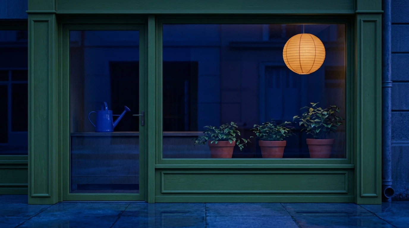
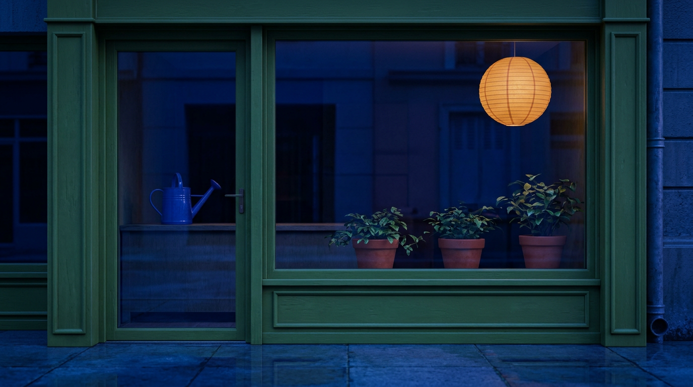
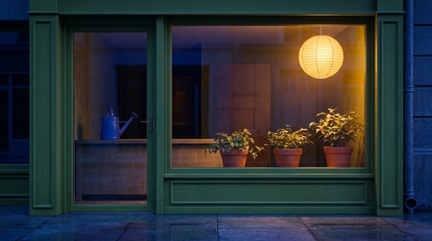
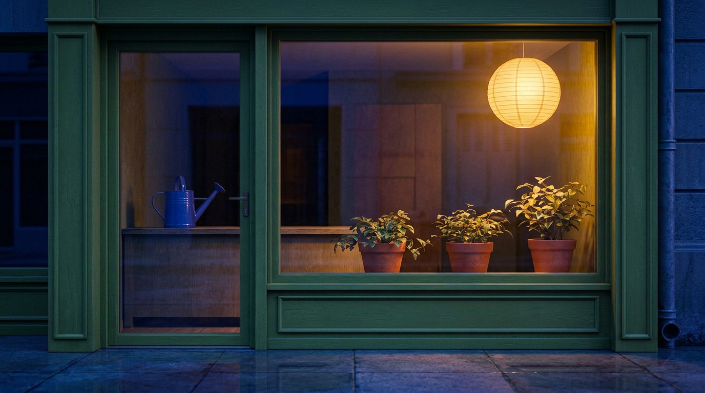
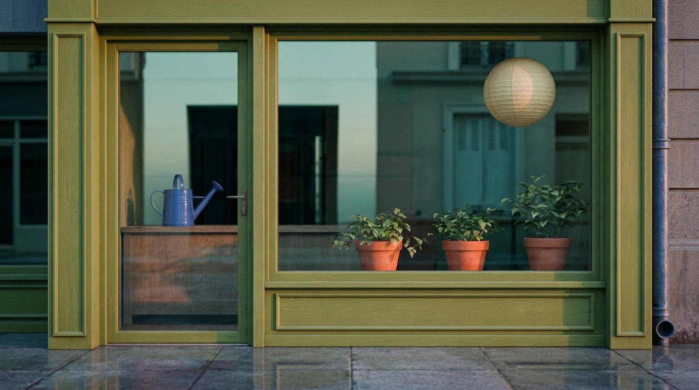
The Night Window is a small original lighting exercise built around one unbranded flower shop. Its proposed progression moves from a quiet cool window, through a warmer invitation, to a morning return. It contains three generated stills, not a complete story or an animated transition. We kept the framing and main props similar so the lighting changes are easier to compare.
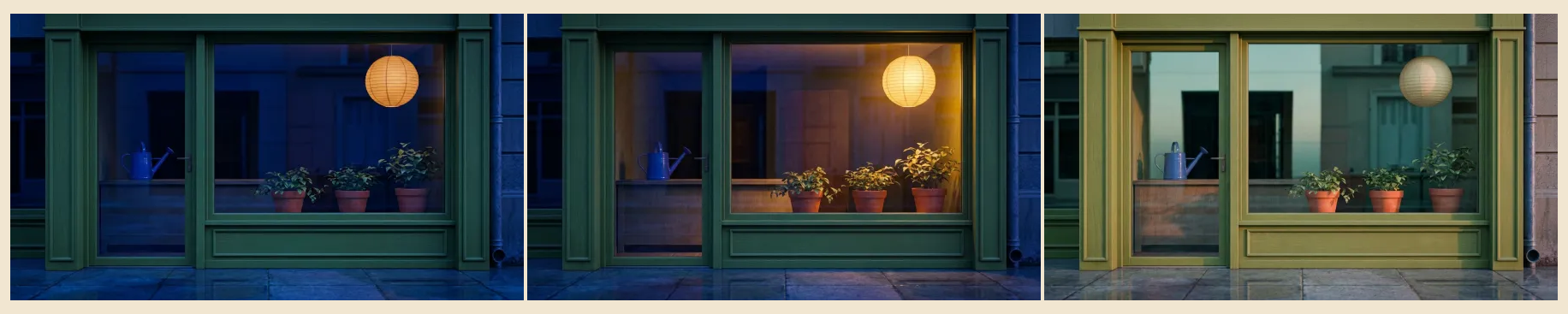
| Moment | Lighting intention | What the returned frame shows |
|---|---|---|
| Closed window | Deep blue ambient light and a quiet pause | Cool shop and street tones, with an already luminous-looking amber lantern |
| The invitation | Concentrate amber light on the interior while retaining cool night reflections | Stronger warm spill on leaves and the counter around the same main layout |
| Morning return | Shift toward daylight and softer teal reflections | Brighter wood and pavement, a cream-gray lantern and pale cool reflections |
The first prompt asked for the lantern to be switched off. The image did not fully follow that instruction: the lantern looks luminous. We retained that result in the source pack rather than relabel it as a successful lights-off frame. If an actual switch-on action were essential to your film, this frame would need revision or replacement before it became an approved scene reference.
The edits keep the broad window, door, watering can and three pots recognisable. They are not pixel-identical: leaf shapes, surface texture and some reflections change. That is acceptable for this bounded lighting discussion, but it is not proof of production continuity or physically simulated illumination. Inspect the original review notes and native images before deciding whether a result fits your own requirements.
Separate chosen palettes from image measurements
The following colors are authored direction for the exercise. They are not automatically extracted dominant colors, calibrated light readings or an exact description of every pixel in the images. Keep that distinction when sharing a palette with another artist or using it in an AI prompt.
| Moment | Chosen palette | Intended relationship |
|---|---|---|
| Closed window | #132B51 · #28514E · #B97A3E | Blue ambience, green frame and a restrained warm anchor |
| The invitation | #19355C · #F7C47A · #56705A | Amber focus held inside a cool night |
| Morning return | #D8B99A · #789A92 · #56705A | Warm wood, pale cool reflection and retained plant greens |
A palette is a starting direction, not a guarantee that a generative model will place each color in the intended area. Describe the light source, affected surface and surrounding context as well. In our warm variation, amber spill on the leaves and counter matters more than merely asking the model to include orange somewhere.
Check value structure as well as hue
Hue can distract from whether the subject and focal area remain readable. Compare a conventional grayscale preview with the color sheet to inspect the relative light and dark shapes. Ask where your eye goes first, whether the important object separates from its surroundings and whether a transition changes the intended visual emphasis.
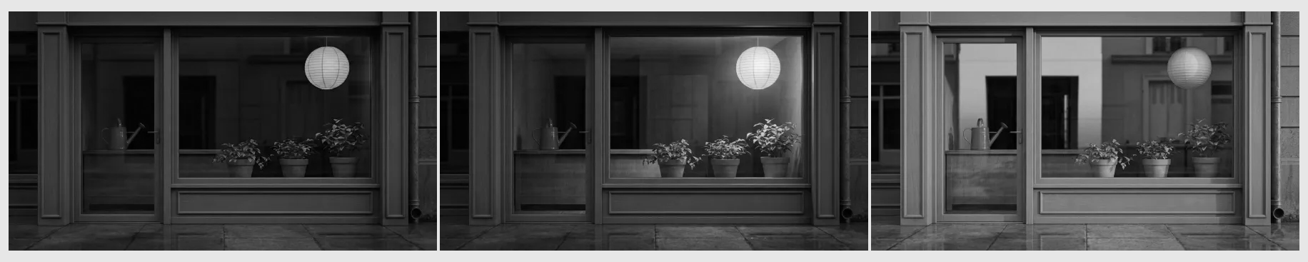
The warm frame gives the lantern and upper plant area a stronger light emphasis. The morning frame distributes brightness more broadly across the storefront. Those are visible compositional differences, not measured exposure settings. This preview does not establish a contrast ratio, legal broadcast range or a final color-managed grade.
Use a reference-guided prompt for each variation
We generated the base image in Clout, prepared that owned image as a ready reference asset, then supplied the same reference to both lighting edits with Nano Banana 2. Reusing the base for both edits kept the comparison anchored to one composition rather than feeding accumulated changes from one edit into the next.
A practical prompt structure is: preserve the composition and named props; change the lighting relationship; specify what stays outside the change. For the warm study, we requested the same green frame, watering can, three pots and upper-right lantern, with stronger amber spill against the cool street. The morning request preserved those anchors while asking for daylight and an unlit-paper appearance.
Use the exact prompt and generation record to inspect the actual requests. Prompt wording records an intention. The returned file and its review determine what was achieved. A reference-guided edit is not a promise that geometry, reflections or tiny plant details will remain identical.
Build your own color script with the free template
- Choose the key moments and write what each should communicate.
- Assign a lighting purpose rather than only a color name.
- Choose a small authored palette and label it as direction.
- Collect or generate images you have the right to use.
- Arrange the complete frames in sequence and review them together.
- Record misses, continuity questions and the next revision beside each frame.
Download the blank color script template for moment, story purpose, lighting direction, three chosen colors, reference file and review notes. The three blank rows are a starting layout, not a required panel count. The completed example CSV shows how the original study uses those fields.
For a visual board, download the three WebP frames below and open our free local moodboard maker. Choose a landscape layout and contain the complete images when preserving the frame matters. Add your moment labels, notes and authored palette, then export the board. The board maker arranges supplied images locally; it does not generate lighting variations or extract the palette automatically.
The standalone printable example embeds all three actual frames and the chosen palette codes. Open it in a browser to Print or Save as PDF. Check page breaks for your intended reader. It is a presentation copy; no direct PDF export or editable production-project format is claimed.
Color script versus storyboard moodboard and final grade
| Material | Main question | Do not assume |
|---|---|---|
| Color script | How do light, color and value develop across moments | That each panel is a finished scene |
| Storyboard | What action and framing communicate the sequence | That every panel has a final lighting solution |
| Moodboard | Which references establish the intended direction | That an unordered collection shows a narrative progression |
| Final grade | How should completed motion footage be balanced and finished | That a palette strip is a LUT or an applied grade |
Use the animatic workflow when you need to test the duration and order of visual moments. A still color script cannot establish how a moving subject, shifting camera or lighting transition will behave. It also cannot prove that the audience reads the intended story without the surrounding action.
Color can support meaning across shots. For the relationship within one image, use our visual metaphor guide and its original concept gallery.
Move the approved direction into AI cinema
Once you accept a frame for its specific role, prepare the action and continuity requirements for Clout AI Cinema or individual takes in Image and Video. Check the selected model’s supported controls and current quote before rendering. Watch the entire returned take for color drift, changed props and whether the intended light relationship survives motion.
For this exercise, a proposed next test would be a short shot where the warm interior becomes visible against the night street. No such video has been rendered here. Keep the still-study approval separate from a motion approval so a successful image does not silently become evidence for an untested scene.
For source placement within one setup, use the lighting diagram guide and free studio planner alongside its controlled original 3D comparison.
Download the original study and source pack
- Cool evening frame and native PNG
- Warm invitation frame and native PNG
- Morning return frame and native PNG
- Color contact sheet and grayscale preview
- Completed plan and blank template
- Printable example
- Prompts and generation records, review notes and file provenance
- Complete original source pack
The study used three completed image jobs at five existing Clout credits each. The cover uses those same frames with authored typography and cropping; it is not a fourth generated scene. The source pack preserves the native files so you can distinguish actual model output from the layout and grayscale derivatives.