

An AI graffiti generator can help explore lettering, color and street-art imagery from a prompt or an accepted reference. Begin with the exact word and intended use, choose a readable treatment, then inspect the exported artwork before adapting it for a poster, digital scene or campaign.
Our original example is HORIZON: yellow lettering with turquoise planes, coral-magenta accents and dark outlines on a fictional concrete wall. The downloadable image is a generated digital concept, not a photograph of an installed mural or an Adobe Firefly result.
Choose lettering or a complete street-art scene
A wordmark, an illustrated character and a full wall composition need different briefs. If the job is a readable title, make the word the primary subject. If the job is a wall concept, describe the environment and how the artwork should sit inside it.
For HORIZON, we chose one word and a straight-on view. That makes the letter sequence easier to inspect than a distant wall with a strong camera angle. The colors and depth treatment are creative choices, not evidence of a physical paint process.
Before generating, record the exact spelling and capitalization you need. Decide whether a plain lettering image is enough or whether the background belongs in the deliverable. A beautiful wall scene cannot replace a separate transparent graphic when that is what your layout requires.
Download the original HORIZON concept
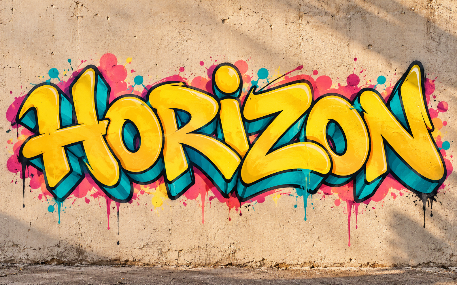
Download the native HORIZON image and its file record. We generated this example with the built-in image generation tool, inspected the word visually and measured the native image at 1586 by 992 pixels.
This is an opaque raster image with the fictional wall included. It is not a font, vector lettering or transparent cutout. Use the native file for inspection; the blog thumbnail is a resized presentation image.
Write an exact-word graffiti brief
Download the original graffiti brief. Keep the wording short enough to review and make the preservation requirement explicit. We separated the exact word from the color, shape and background instructions.
Create an original digital graffiti concept with the word HORIZON, spelled H O R I Z O N. Keep all seven letters clearly legible and fully inside the frame. Use rounded expressive lettering, yellow fills, turquoise depth planes, coral-magenta accents and near-black outlines. Show it straight on against a fictional pale concrete wall with no other words, people, signatures or logos.
A spelling instruction is a request, not a validation result. The model may still join, repeat or replace a letter. Compare the export with the written word instead of deciding only from its visual energy.
For a longer phrase, consider separating words or adding editable typography after creating the imagery. That can make a small correction easier than regenerating an entire wall composition.
How Adobe describes its graffiti generation workflow
Adobe’s official Firefly graffiti page describes generating street-art imagery from a text prompt and using an optional reference for structure or composition. Its documented steps start in the Image area, continue with a prompt and optional reference, then generate and download or edit the result.
That documents a creative route, not a Firefly test performed for this guide. Check your current account, selected model, supported references and export options. A model’s ability to produce graffiti-style imagery does not establish exact spelling or an editable font file.
In Clout Image and Video, inspect the current supported image operation for your brief. Do not assume it exposes identical controls or output formats. Review the actual exported file before choosing the next editing step.
Inspect letters before texture and effects
Read the word from left to right and compare it with the accepted text. Check whether an outline, overlap or highlight makes one letter look like another. Then inspect the whole composition at the size where the audience will see it.
For HORIZON, the important identity is the complete letter sequence, not a particular drip pattern. The dot-like treatment over the I is a visual detail; it should not make you overlook a missing or doubled character elsewhere.
Use the blank lettering review sheet for your own candidates. Record the accepted text, what the image appears to say, any unclear region and the decision. The sheet does not contain fabricated provider results or automatic spelling scores.
Use color and depth to support the word
Choose a clear relationship between the fill, outline and surrounding wall. If the letter edges disappear into similar-colored accents, simplify the palette or move those accents outside the word. A strong silhouette helps the design stay readable when resized.
Review depth consistently across the letters. A dramatic shadow can add energy, but contradictory planes can make a simple word harder to parse. Keep the intended treatment in the brief and inspect whether it remains coherent through the whole composition.
Judge the final crop separately. Preserve complete outer letters and leave enough margin for the placement. If a poster needs its own headline or date, reserve space for those editable elements instead of asking the generator to solve every part of the layout at once.
Adapt the concept to a real deliverable
For a social image, inspect the actual delivery crop and readability. For a poster or shirt, prepare the artwork for the selected template and production requirements. Our AI T-shirt workflow includes a free pixel-to-print-size planner for that separate decision.
If you are visualizing artwork on an existing wall, use a reference you are authorized to edit and distinguish the digital proposal from an installed work. Keep the location, camera perspective and retained surroundings in the review brief rather than presenting a generated scene as documentation.
For lettering without the wall, choose an editing or generation route that delivers the required separate graphic. Renaming an opaque PNG does not remove its background, and converting a file extension does not turn its pixels into vector paths.
Save the accepted word and artwork version
Keep the exact text, prompt revision, reference identifiers and native export together. After changing the colors or crop, repeat the letter and layout review on the new file. Save the final version you actually accepted.
The useful result is a clear original design for its intended placement. Our HORIZON example demonstrates a generated digital concept and a review method; it does not establish a physical installation, a font system or production-ready artwork for every format.


